MIGROS MOBILE APP
- Adobe Illustrator
- InvisionApp
Migros is a large, medium to high end grocery store chain in Turkey. We worked with them on the ground for one week to help them redesign a mobile app for improving the in-store customer experience.
The key customer insights here are 1) getting customers to use this app before or in store while shopping constituted a huge behavior change and thus required the app to have one, very compelling reason for use, 2) customers in Turkey cared a ton about getting a good deal and not so much about organized shopping like making lists or speeding up their time in store...in fact, many Turkish customers enjoyed wandering around in the nice environments of Migros stores and touching and feeling the products, and 3) the app has an identity crisis and is often confused with Migros' other app that allows for online grocery shopping.
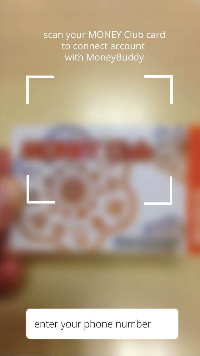
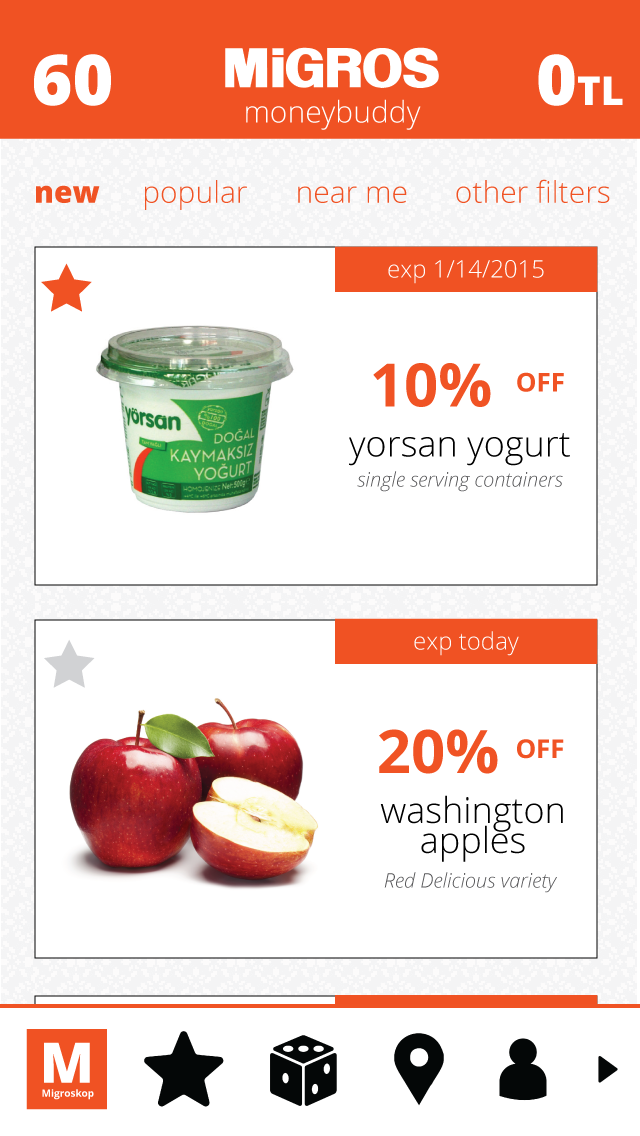
Due to these insights, we designed an app, called the Migros MoneyBuddy that helps deal-loving shoppers maximize savings by offering them the most relevant promotions in one place. In designing this app, we focused on making the action to get a reward (savings) as easy as possible -- just a simple scroll. Additionally, because the user base has yet to have as extreme familiarity with mobile phone usage as the US audience does, we made sure all actions in the app can be easily reversable with just one to two taps. Finally, we were careful to cluster most relevant actions near the bottom and to the right, where most right-handed users can easily reach them, especially on larger iPhone 6s.


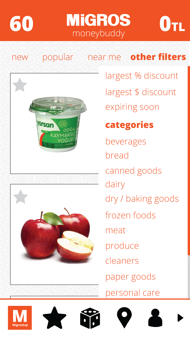
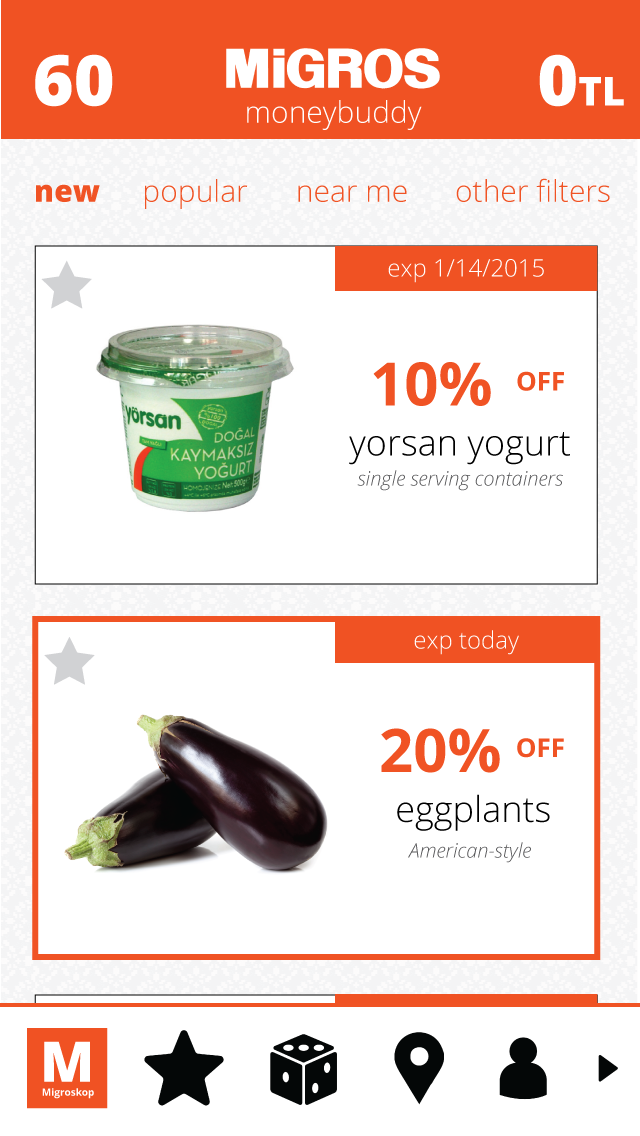
All deals are auto-sorted by relevance to the user, who needs to link their loyalty card to use the app, and additional filters are all applied on top of the relevance sort. This is because we found it difficult to imagine a scenario in which a customer does not want the most relevant deals on top.
Additionally, the data consistently shown on the screen are the loyalty card points on the left of the app's name and the total savings in Turkish Lira on the app name's right. This makes these two stats constant and up front, focusing users on the benefit they are receiving from using the app and helping them easily keep score.
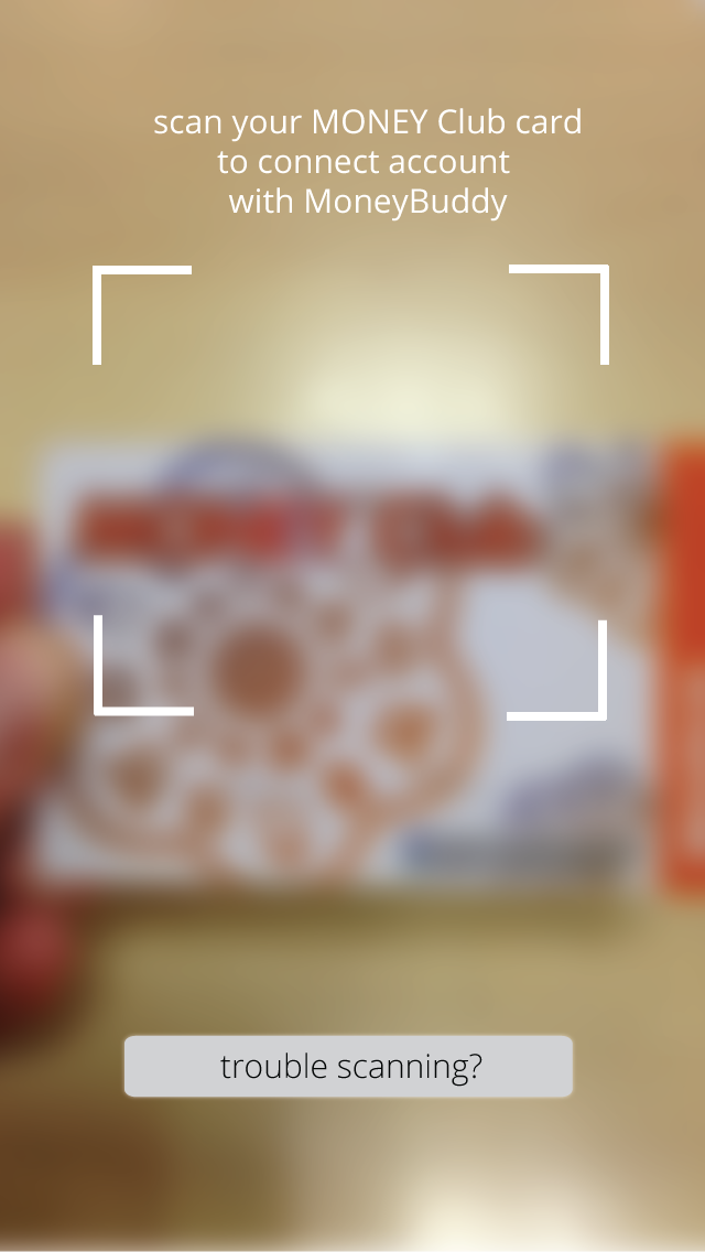
We didn't require the customer to scan their card in until they have already seen the main screen of deals, thus allowing them to see value before forcing them to take any additional action.
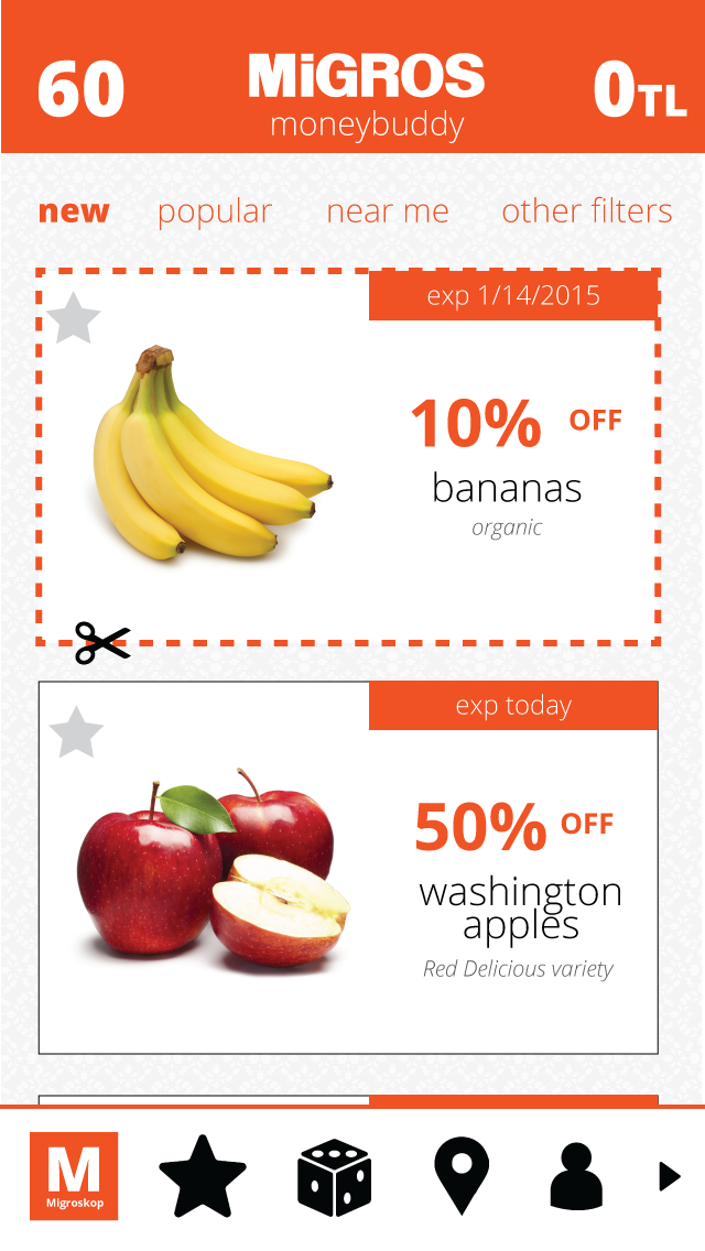
We chose a deal card as the main conveyer of a deal because it has a lot of flexibility for adding additional information if necessary (though we believe this has all the required information) and for indicating if it's special in any way, through the border colors and styles. For example, some deals are constant deals while others are coupons that must be saved to be applied on a customer's next visit. Additionally, borders can be used to highlight hyper-personalized deals.
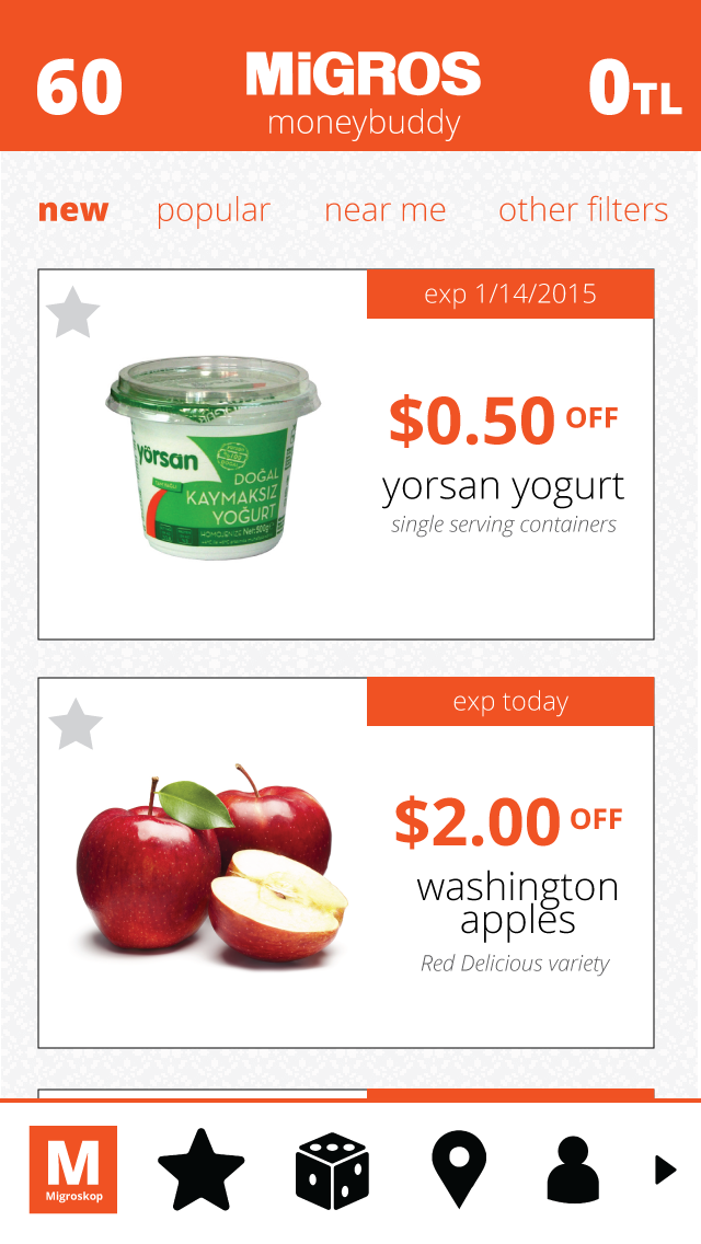
To enhance ease of use and avoid making the customer tire themselves out mentally with calculations, we adopted a feature that is currently popularized in the iPhone's stock application -- upon hitting the number of the discount, it toggles between showing percent discount, dollar discount, and loyalty card points gained.
Again, piggybacking off behaviors the iPhone has already taught audiences, we allow users to swipe down to see the search bar and search deals.

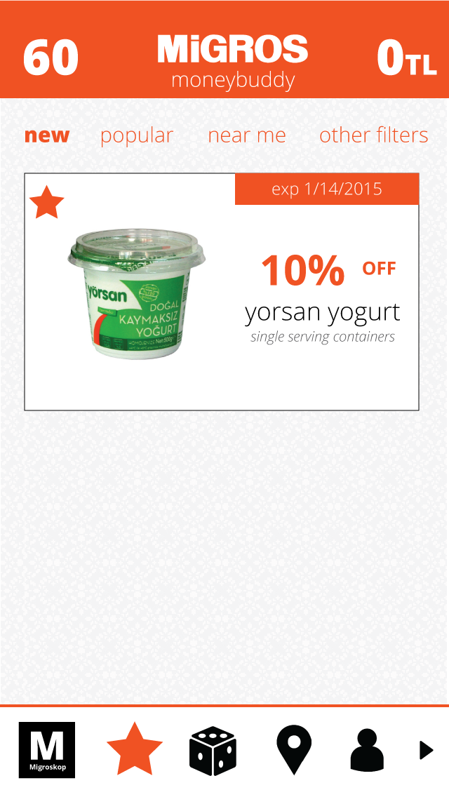
Also to enhance ease of use, we allow the user to tap anywhere on the left side of cards to favorite a deal and have it automatically applied to their next purchase containing that item. This is in lieu of forcing them to very precisely tap only the star.
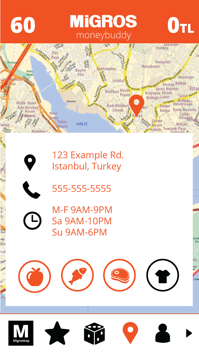
We designed the find store screen to all be included in one screen instead of leaving the original screen to see a single store's information.
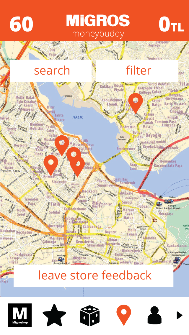
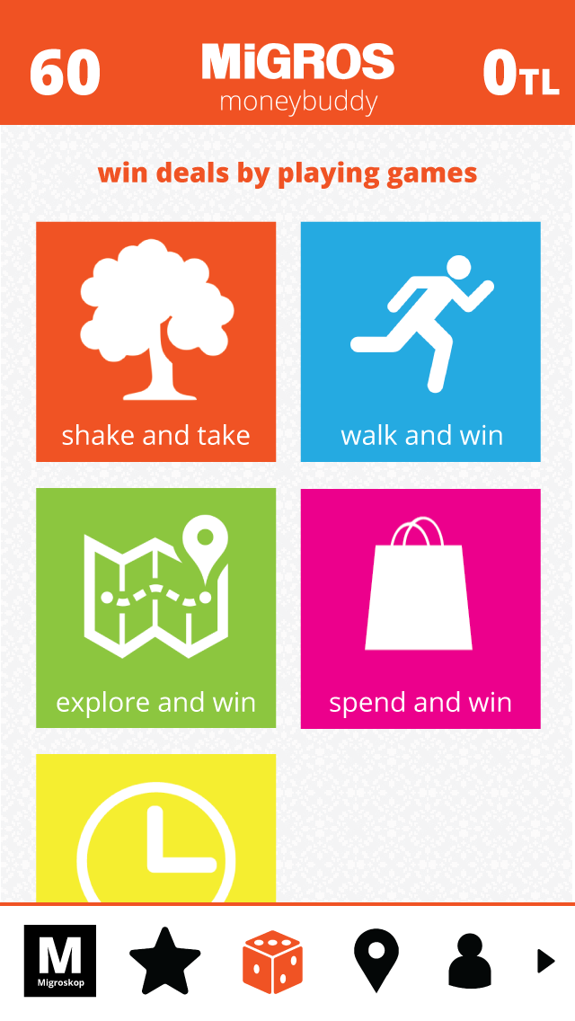
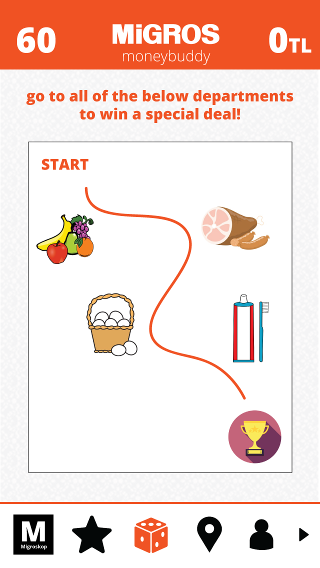
We ported over existing popular savings games and added one of our own where the shopper has to walk around certain parts of the store to collect a discount at the end in one of those sections. The store uses iBeacon to track the user.